
Issue #02 The Quiet Power of Wimbledon Branding 🎾
Wimbledon isn’t flashy and that’s exactly why brands love it.

In a world where most brands chase virality, visibility, and volume, Wimbledon stands apart by whispering rather than shouting. And that whisper, which is refined, elegant, and distinctly British speaks volumes.
Unlike many global sporting events, Wimbledon doesn’t do loud. There are no LED billboards or over-the-top halftime shows.
And that’s by design.
Wimbledon embodies restraint. Its visual identity is all whites and greens. Its traditions, such as strawberries and cream, royal boxes, and silence during serves, communicate heritage, class, and control.
For brands that value those things, Wimbledon is a perfect mirror.
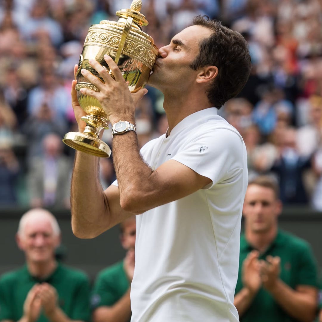
Case in Point: Rolex
The timekeeper of tennis’s most prestigious stage since 1978.
At Wimbledon, Rolex doesn’t dominate the visuals. It waits quietly for the moment: match point, tiebreak tension, the slow zoom on the scoreboard. That’s when the logo appears, understated and perfectly placed.
Brand Values Aligned: Precision. Timelessness. Trust.
Visibility Strategy: High-impact moments, not high-frequency noise.
Lesson: Sometimes, your brand wins by showing up exactly when it matters.
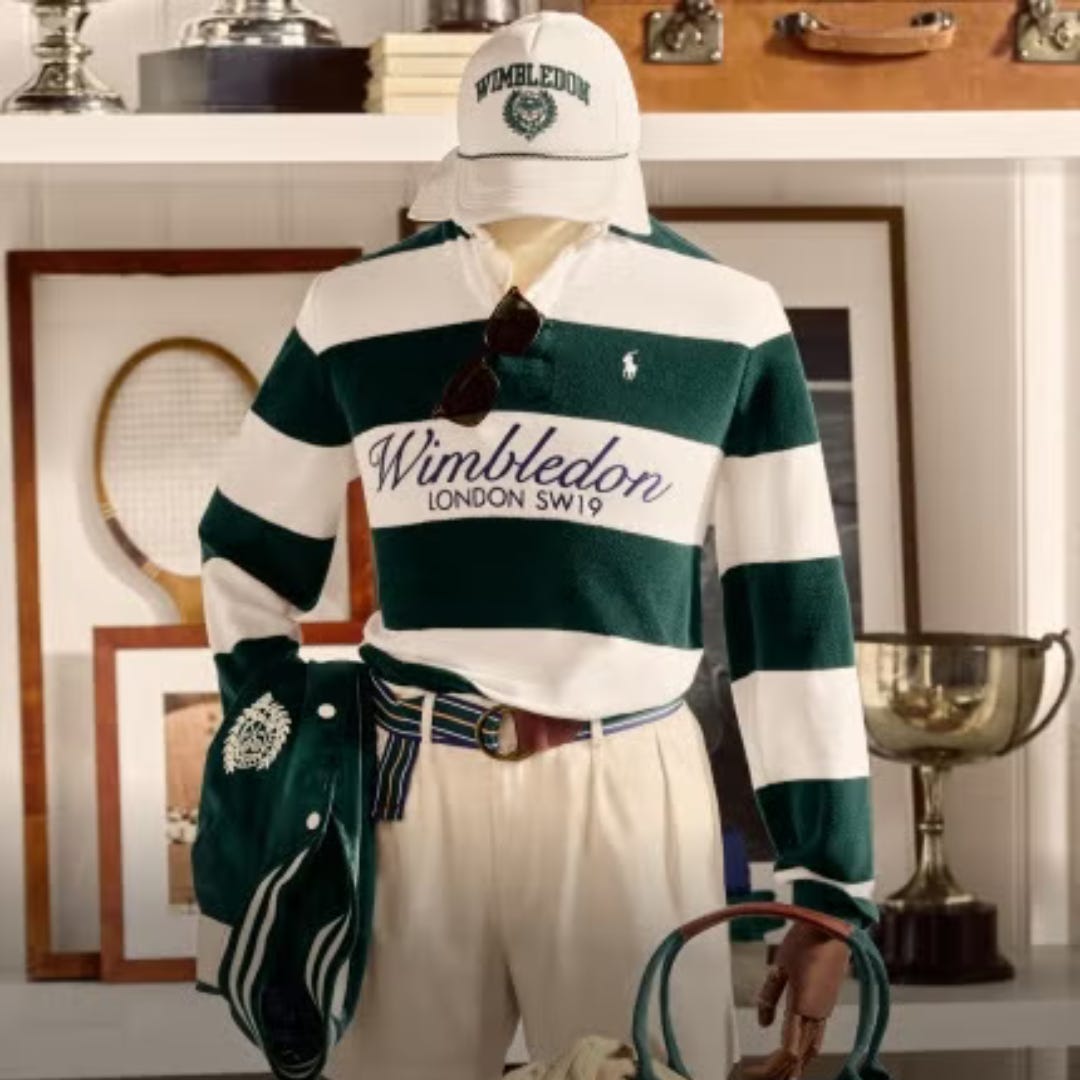
Case in Point: Ralph Lauren
When Ralph Lauren took over Wimbledon’s uniforms in 2006, it wasn’t a costume change. It was a branding coup.
Every time a ball kid sprints across Centre Court or an umpire stands poised in a navy blazer, Ralph Lauren gets brand exposure wrapped in elegance.
Brand Values Aligned: Classic. American. Elite yet understated.
Tactic: Branded uniforms, visual identity, subconscious style influence.
Lesson: Dressing the stage lets your brand become the aesthetic, without needing a slogan.
One Great Insight
At Wimbledon, silence isn’t the absence of branding; it is the branding.
By resisting noise, brands signal confidence, elegance, and control. This makes Wimbledon the perfect platform for brands that don’t need to chase attention — they command it quietly.